Munic is my personal brand. My first project began in December 2021. Since then, I’ve primarily focused on landing page design and website implementation, branding, social media design, video editing, and graphic design. While I prefer working on blockchain-related projects, I’m always open to taking on others that show potential.
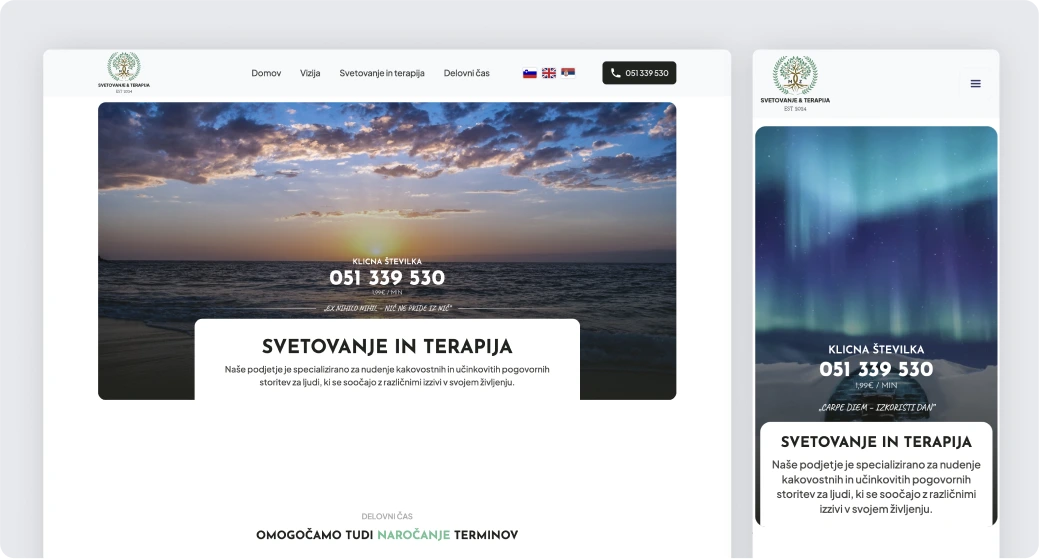
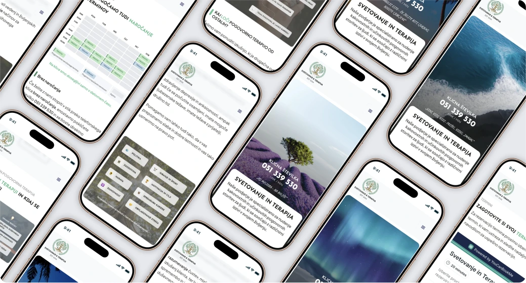
The company offers high-quality phone-based conversational support for anyone needing a listening ear, guidance, or someone to talk to. Their service is inclusive, catering to those facing challenges, feeling lonely, or seeking quick advice—not just serious mental health concerns.
Known for their open, judgment-free approach, they provide a safe space where clients can discuss any topic with care and respect. Conversations are available in Slovenian, Serbian, or English, ensuring accessibility for diverse clients.
🎯 The goal:
The client aimed to create a cohesive brand identity and digital presence that reflected their values of safety, growth, and calmness. They envisioned a landing page with dynamic nature-themed wallpapers in the hero section to evoke peace and ease. The branding emphasised bright, earthy tones for a calming effect, with a tree-inspired logotype symbolising growth and life. Additionally, they required print materials such as flyers and business cards, as well as social media content, to effectively communicate their services.
💼 My contribution:
I began by designing the brand identity, ensuring it aligned with the client’s vision of trust and personal growth. Once the branding was established, I created wireframes for the landing page, prioritizing a user-friendly layout and intuitive navigation. With the client’s approval, I designed a fully responsive landing page that incorporated serene natural wallpapers, earthy tones, and branding elements to create a calming and inviting user experience.
Beyond the design, I implemented the website myself, ensuring it functioned seamlessly in all three requested languages. I connected the website to its domain and took care of basic SEO, optimizing it to improve visibility and accessibility online.
In addition, I designed all graphics for the landing page to ensure they were unique and consistent with the brand. I created print materials, such as flyers and business cards, that effectively communicated the client’s services. To support their marketing efforts, I developed engaging social media content, establishing a cohesive brand presence across digital platforms. This holistic approach resulted in a professional, user-friendly platform and branding materials that helped the client connect with their audience and communicate their services effectively.
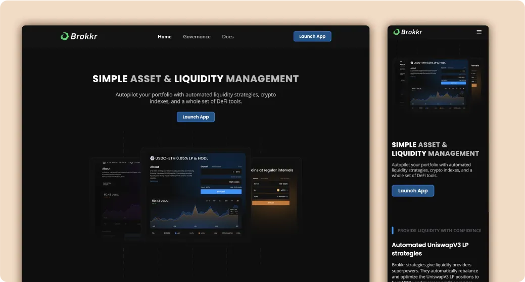
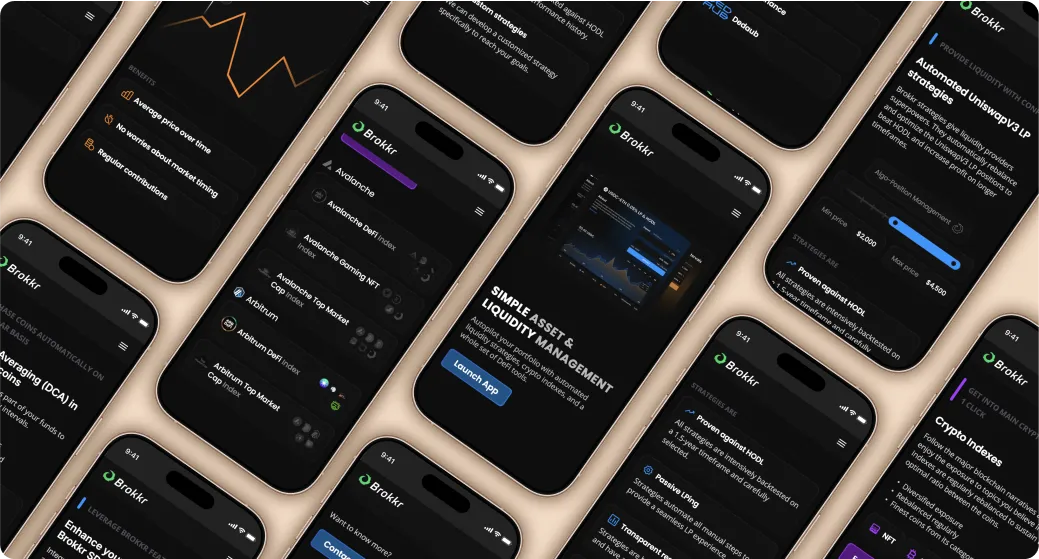
Brokkr is a DeFi platform specialising in algorithmic investment and liquidity management, aiming to optimise returns while minimising risks like impermanent loss. It employs advanced strategies for managing assets in concentrated liquidity pools such as Uniswap V3, with a focus on transparency and reliability through performance metrics and backtesting.
🎯 The Goal:
The main objective for the Brokkr landing page was to effectively present the platform and its features to potential users in a visually appealing and intuitive way. A unique design element requested was the use of distinct colours to represent each feature, ensuring clarity and ease of navigation for users.
💼 My Contribution:
I started by planning the structure and layout of the landing page, creating wireframes to map out the flow and organise information clearly. After the wireframes were approved, I moved to the design phase, choosing a colour palette to differentiate features while keeping the overall look consistent. I also created animation prototypes in Figma to show how interactive elements would function.
In addition to the landing page, I contributed to marketing efforts by designing presentations, creating visuals for marketing campaigns, and making promotional videos to highlight Brokkr’s features. My focus was on delivering a user-friendly and engaging experience that aligned with the platform’s goals.
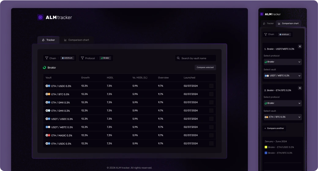
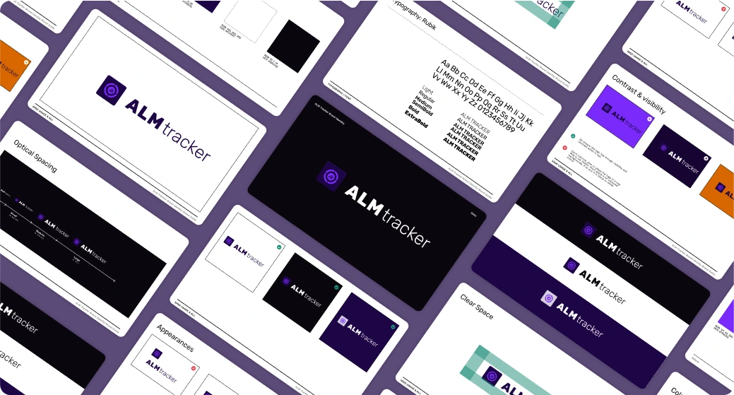
The Brokkr ALM Tracker is a DeFi tool designed for monitoring and optimising liquidity and asset management. It helps users minimise risks like impermanent loss while balancing liquidity provisions and liabilities, aligning with Brokkr's mission to deliver transparent, algorithm-driven solutions for efficient financial strategies.
💼 My Contribution:
I focused on designing an intuitive platform to track and compare DeFi protocols across various blockchains. The primary goal was to create a modern dark-mode interface. The design allows users to view and compare different protocols within selected chains, enabling them to make informed decisions by analysing performance data.
Working closely with the client, I handled all aspects of the design process, from branding to the creation of a visually appealing yet functional layout. The interface was carefully crafted to prioritise usability, with clear information hierarchy and interactive elements that make navigating through different protocols seamless.
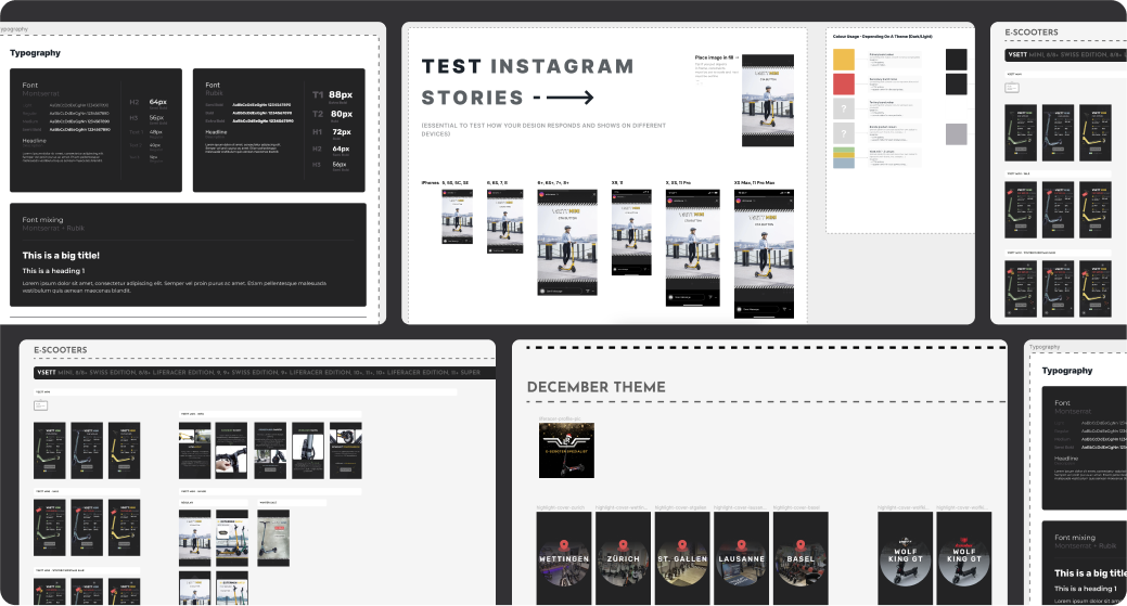
They are a Swiss e-commerce platform specialising in the sale of high-quality e-scooters. They offer a variety of electric scooters designed for urban commuting and leisure. The platform focuses on providing reliable, eco-friendly transportation solutions for customers looking to navigate cities more efficiently and sustainably. With a commitment to quality and customer satisfaction, Liferacer.ch features a selection of scooters suited for different needs, ensuring a smooth and enjoyable ride for all users.
💼 My Contribution:
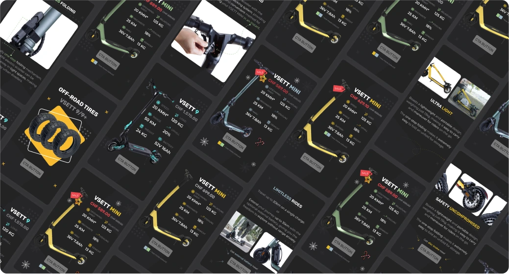
I previously worked with Liferacer.ch on improving some aspects of their website, to enhance user experience and align with the brand’s vision. After the landing page redesign, I continued to support them by creating social media post templates for an upcoming marketing campaign. The goal was to create a cohesive set of visuals that maintained the brand's identity and communicated the value of their electric scooters to the target audience.
These templates were designed to be flexible yet consistent, making it easy for the marketing team to produce engaging content across various social media platforms. By focusing on clean, eye-catching designs, I ensured that the campaign would resonate with the audience while remaining aligned with the overall brand aesthetics.
Through these contributions, I helped Liferacer.ch strengthen their digital presence, improve their user experience, and provide a consistent visual identity across both their website and social media platforms.
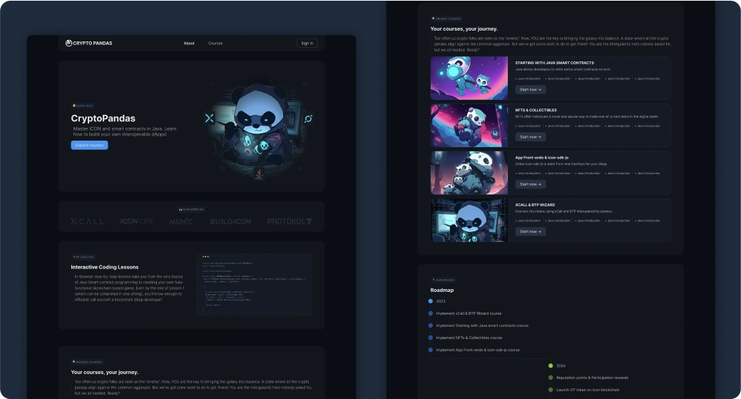
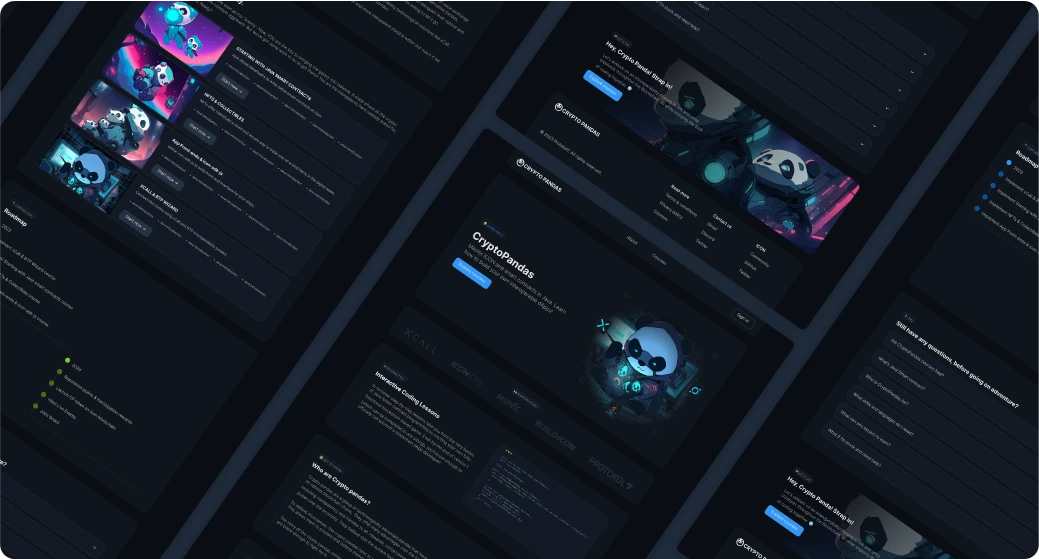
Crypto Pandas is an educational platform that uses gamified, step-by-step lessons to teach Java smart contract programming. Users progress from basics to creating blockchain-based games, gaining foundational skills after just one lesson. The platform’s creative narrative features tech-savvy pandas promoting decentralised systems, opposing centralised ones represented by conservative pandas. This storytelling approach makes learning blockchain concepts like transparency and decentralization engaging and accessible.
💼 My Contribution:
I designed and implemented the landing page, ensuring it effectively communicated the platform's goals while being visually engaging and responsive across devices. The landing page design emphasized clarity and creativity, aligning with the playful yet educational theme of the platform. For the platform itself, I developed its UI/UX design, focusing on user-friendly navigation and functionality. My design aimed to make the learning process seamless and enjoyable, complementing the platform’s mission of teaching blockchain development in an accessible and creative way.
The platform is set to launch soon, offering an engaging experience for aspiring blockchain developers.
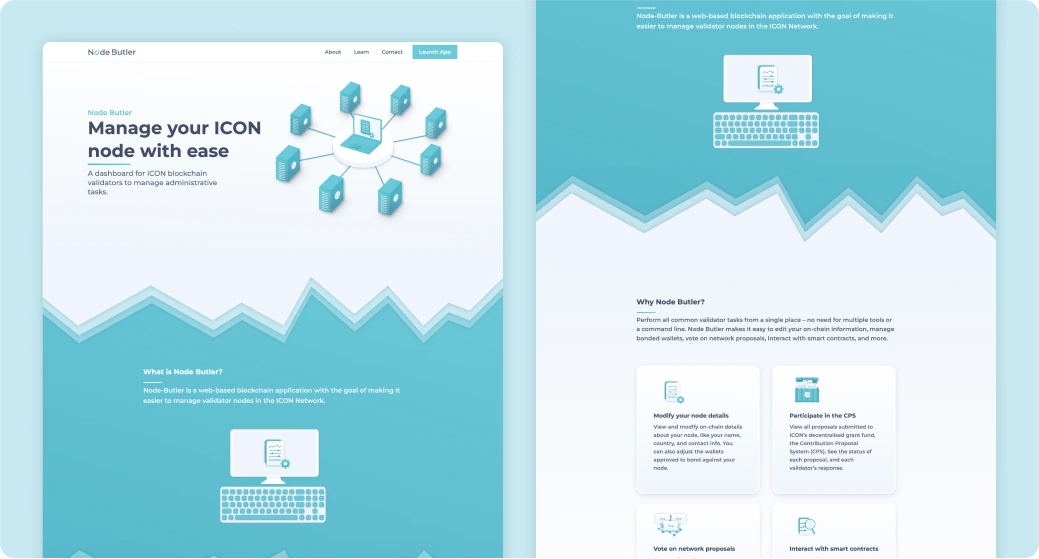
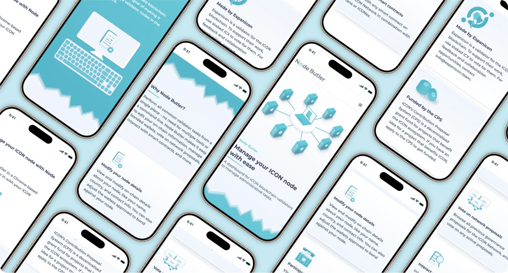
Node Butler is a platform designed for ICON blockchain validators to manage administrative tasks through a centralised dashboard. It helps validators monitor and operate their nodes efficiently.
🎯 The Goal:
Node Butler wanted to redesign its website to better reflect its functionality while aligning with the signature green-blue colour scheme and modern aesthetic of the ICON blockchain. The main objective was to create a user-friendly, informative website that showcases the platform's features while staying true to ICON’s visual identity.
💼 My Contribution:
I was responsible for both designing and building the website to align with the platform's purpose and the ICON blockchain's signature style, which prominently features green-blue tones. My work started with designing custom visuals to represent nodes, developing a new logo, and creating graphics that effectively showcased the platform’s key features.
To ensure the site was user-friendly and visually engaging, I began by crafting detailed wireframes for desktop, tablet, and mobile layouts. This step allowed me to establish a responsive structure and ensure smooth navigation across devices. Once the designs were approved, I implemented the website using Webflow, translating the visuals and layout into a fully functional and polished final product.
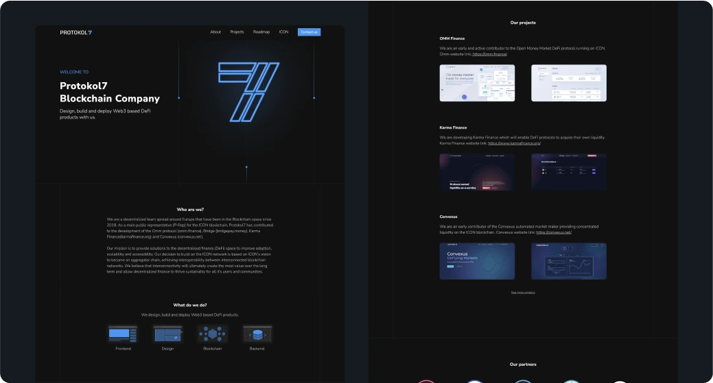
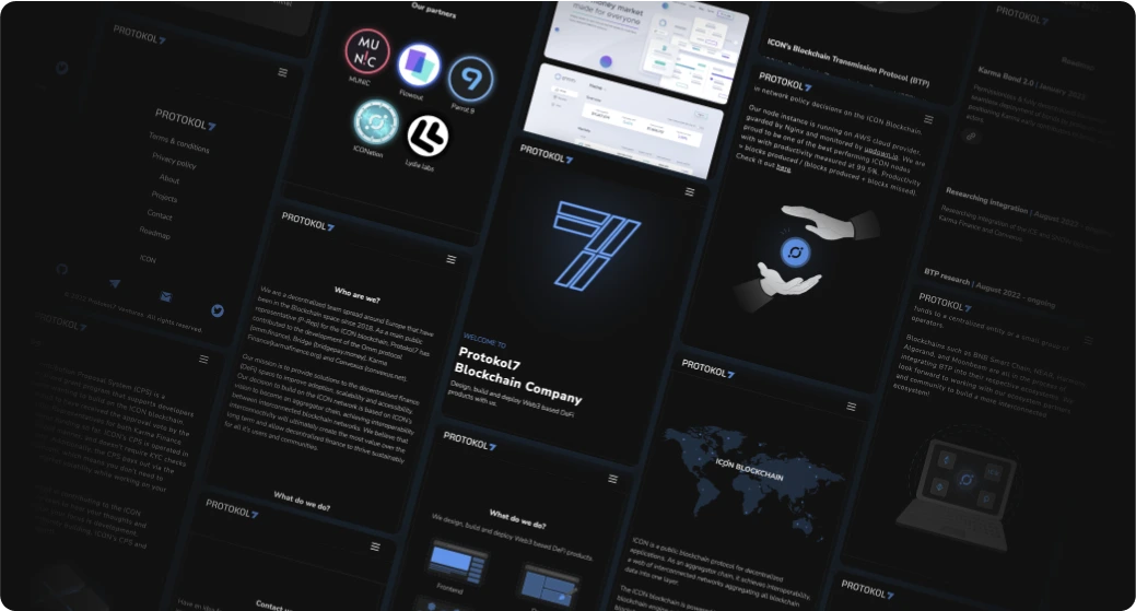
Protokol7 is a blockchain company specializing in the design, development, and deployment of Web3-based DeFi products. As their brand emerged, I was entrusted to shape their visual identity from the ground up, designing a cohesive brand and an evolving website to reflect their vision.
💼 My Contribution:
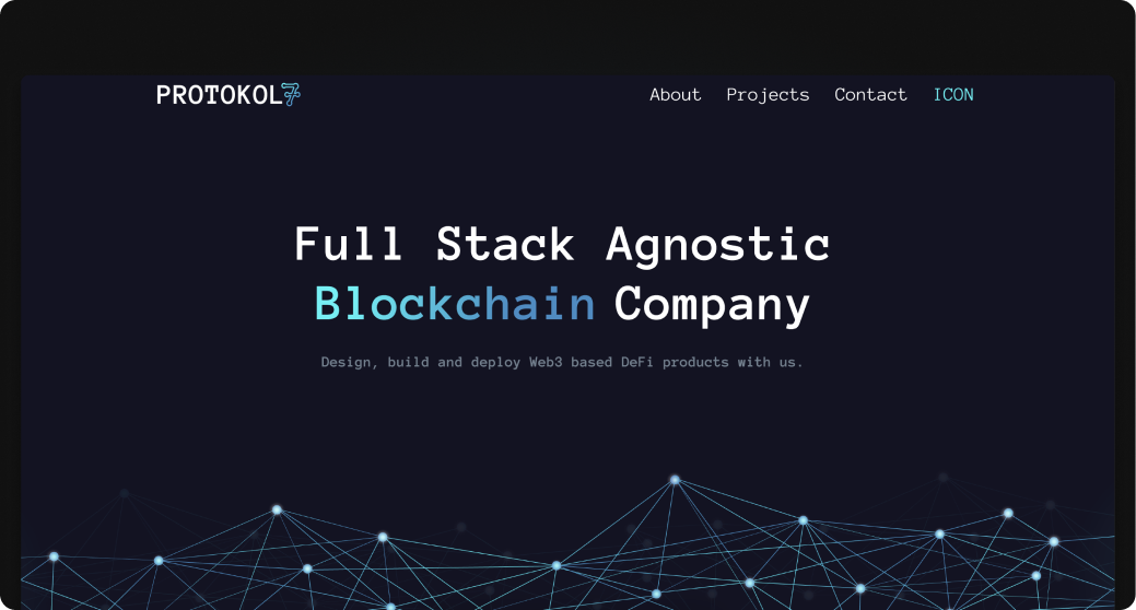
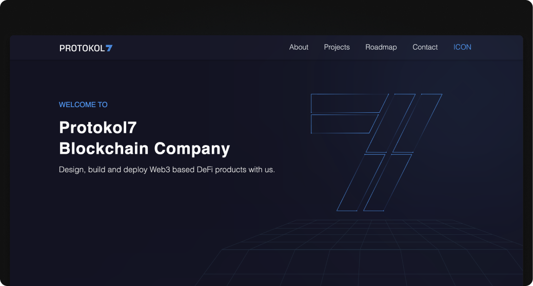
I implemented and designed Protokol7's entire branding, including their logo, which symbolically represents blockchain connections through blocks forming the number 7. The website design featured a dark theme with blue tones to convey trust, stability, and intelligence, evolving from initial gradients to a more polished single-colour approach.
Each iteration emphasised professionalism while incorporating blockchain-inspired elements like connecting lines symbolising the interconnectedness of the team and the technology. The collaboration allowed me to refine my skills, adapting feedback into meaningful improvements. Working with Protokol7 marked an important milestone in my growth as a designer and reinforced my commitment to learning and innovating.
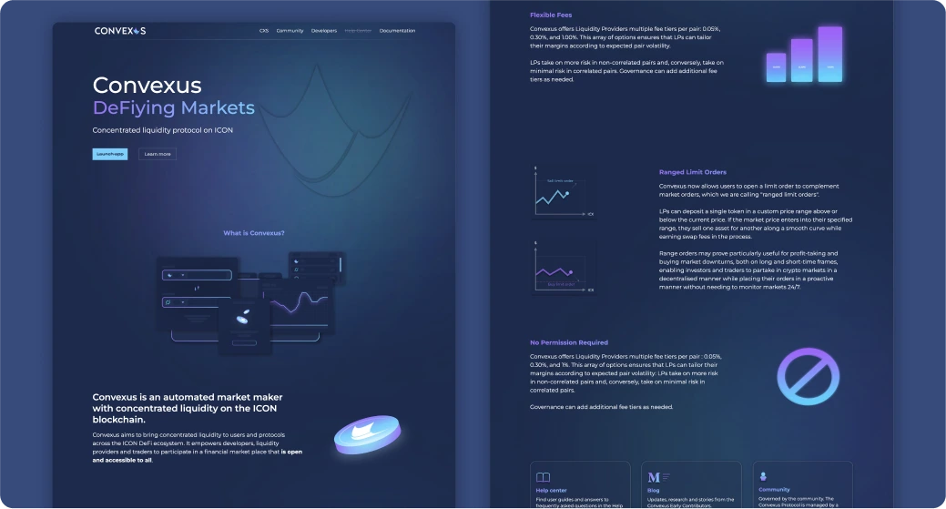
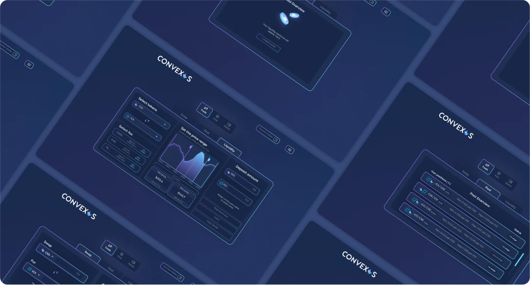
Convexus is an automated market maker (AMM) built on the ICON blockchain, offering concentrated liquidity to enhance the efficiency of decentralised finance (DeFi) transactions. Drawing inspiration from platforms like Uniswap V3, Convexus aims to provide an easy-to-use interface that simplifies DeFi trading and liquidity management for users.
🎯 The Goal:
The goal of the Convexus project was to design a modern crypto-themed interface with a dark aesthetic and smooth gradients, while ensuring the platform remained user-friendly. The design aimed to showcase Convexus’s key features in a simple, visually engaging way, balancing style and usability for an intuitive decentralized finance (DeFi) experience focused on liquidity management and trading.
💼 My Contribution:
I played a key role in both the UI & UX design and the development of Convexus’s platform. To start, I conducted in-depth research, studying platforms like Uniswap V3 to understand the required functionalities.
I then created wireframes for desktop, tablet, and mobile versions, ensuring a responsive and user-friendly layout. I designed custom visuals for the app, focusing on highlighting key features in an engaging way, while maintaining a consistent crypto-themed aesthetic across the platform. Additionally, I contributed to the platform's frontend development by implementing the design using HTML and CSS.
Alongside this, I helped create the Convexus landing page, which I implemented using Webflow. The page effectively communicated the platform’s features while maintaining a clean, user-friendly layout.
Although the platform has not yet been released, my work ensured that the design and functionality were ready for launch, with a focus on creating an intuitive, visually appealing user experience for the crypto community.