Portfolio
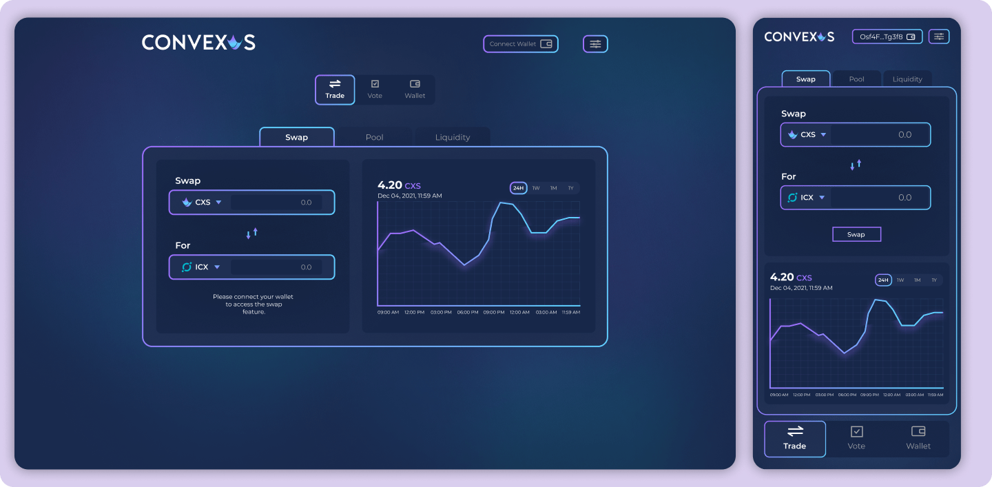
Convexus app
Convexus is an automated market maker with concentrated liquidity on the ICON blockchain.

About Convexus project
Convexus is an automated market maker with concentrated liquidity on the ICON blockchain. The primary goal was to keep the UI crypto themed, which is primarily dark with pleasing gradients.
Convexus is similar to Uniswap V3. I studied what Uniswap V3 is and how it works in order to understand what needs to be done. Main goal was to make the app easy to use and simple to understand.
I will write more detailes about Convexus app once it is launched.
Convexus is similar to Uniswap V3. I studied what Uniswap V3 is and how it works in order to understand what needs to be done. Main goal was to make the app easy to use and simple to understand.
I will write more detailes about Convexus app once it is launched.
Convexus landing page
Convexus is an automated market maker with concentrated liquidity on the ICON blockchain.
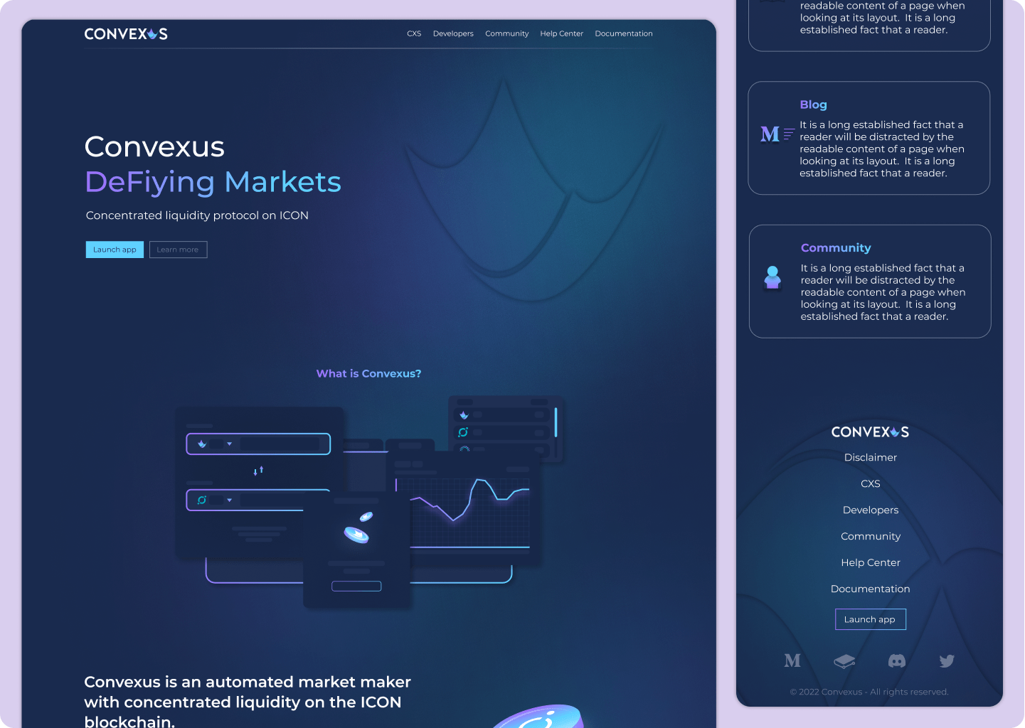
About Convexus project
The primary goal was to keep the UI crypto themed, which is primarily dark with pleasing gradients.
They desired a website that provided all important information about the Convexus app while remaining simple and engaging in order to keep users interested in the app.
My solution:
- Custom made visual graphic of the app,
- mention key points what Convexus brings with intresesting visuals,
- offer them links to learn more about Convexus.
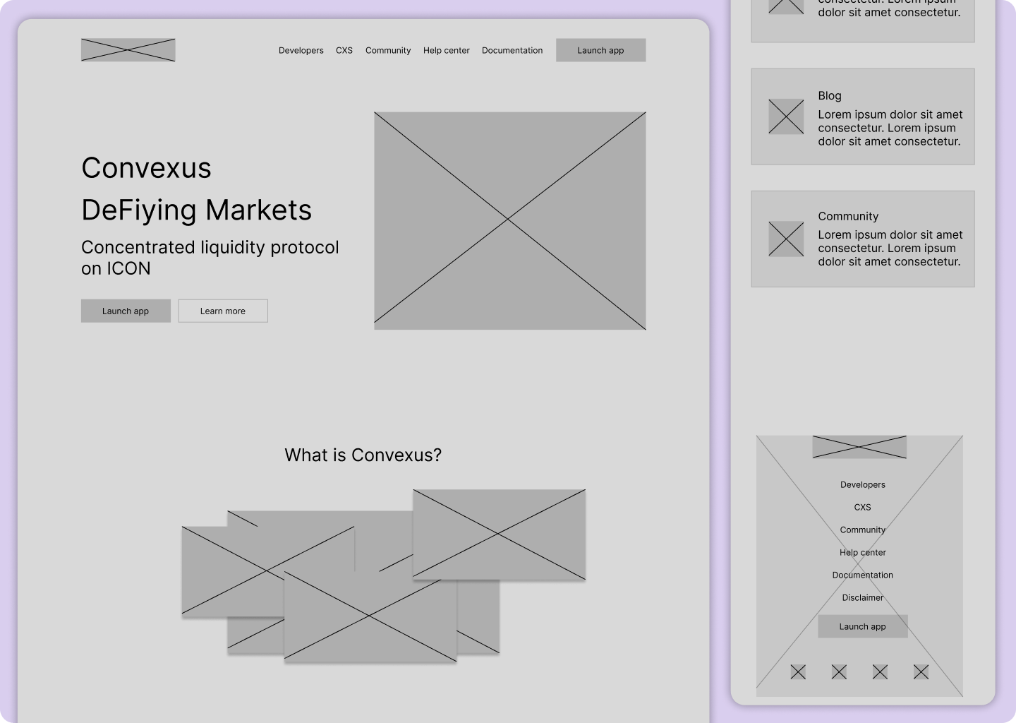
After determining the goals, I created a website wireframe with layouts for desktop, tablet, and mobile devices.
They desired a website that provided all important information about the Convexus app while remaining simple and engaging in order to keep users interested in the app.
My solution:
- Custom made visual graphic of the app,
- mention key points what Convexus brings with intresesting visuals,
- offer them links to learn more about Convexus.
After determining the goals, I created a website wireframe with layouts for desktop, tablet, and mobile devices.
Node Butler landing page
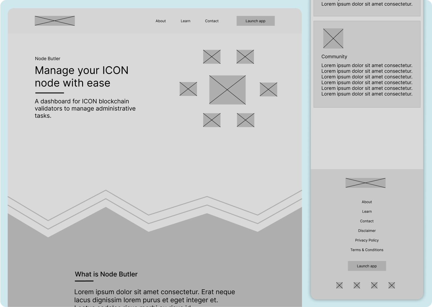
Node Butler is a dashboard for ICON blockchain validators to manage administrative tasks.
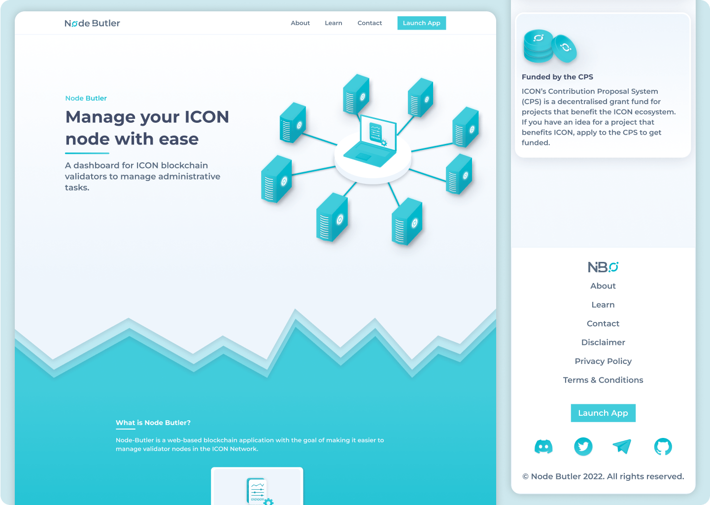
About Node Butler project
They desired a redesign of their previous website. Because Node Butler is built on the ICON blockchain, they wanted a website designed in the ICON signature style.
My solution:
- Custom made visual graphic that represents a node,
- mention key points what Node Butler offers with intresesting visuals,
- offer them links to learn more about Node Butler,
- new logo.
After determining the goals, I created a website wireframe with layouts for desktop, tablet, and mobile devices.
Here's how Node Butler used to look:
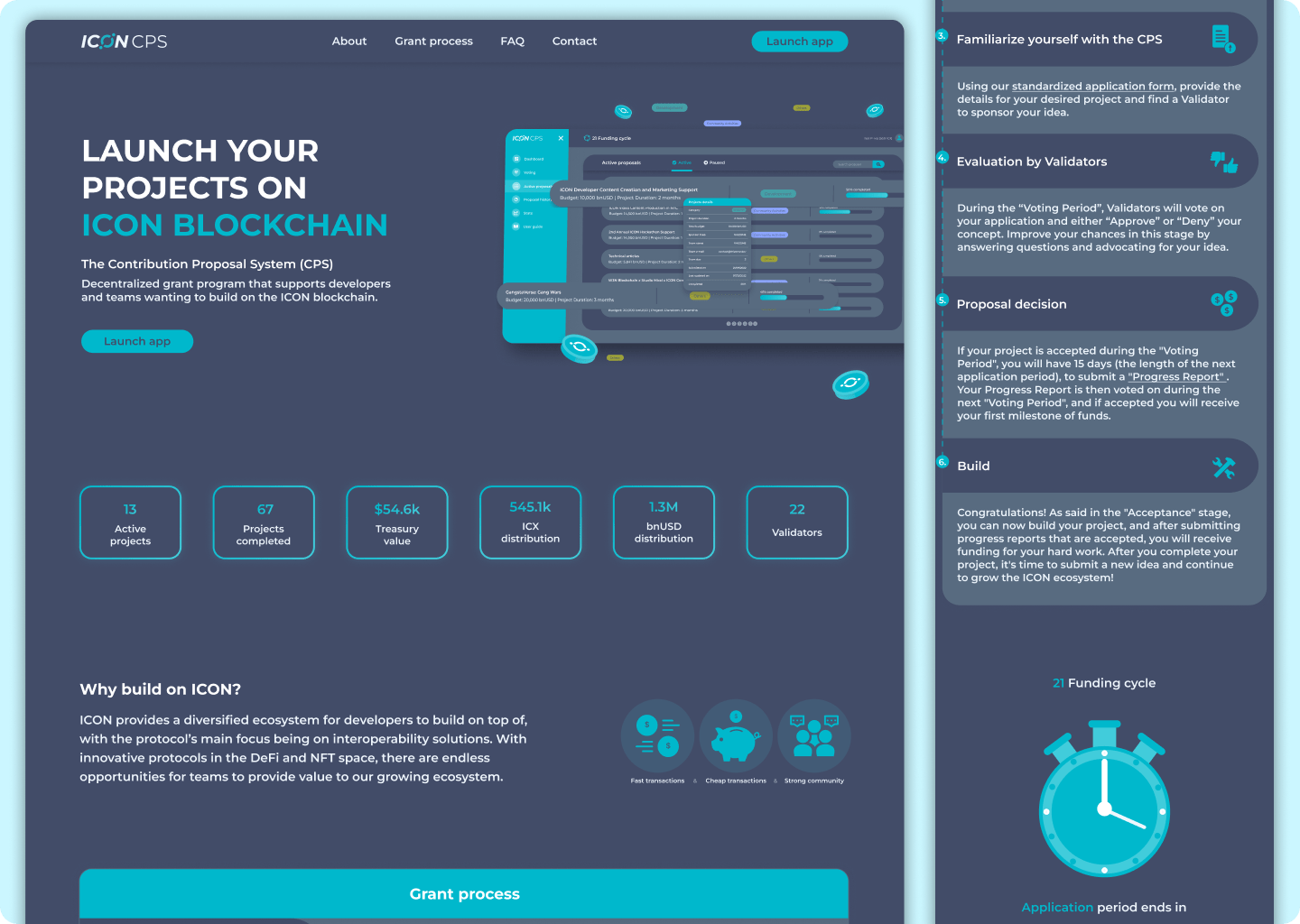
ICON CPS landing page
Node Butler is a dashboard for ICON blockchain validators to manage administrative tasks.
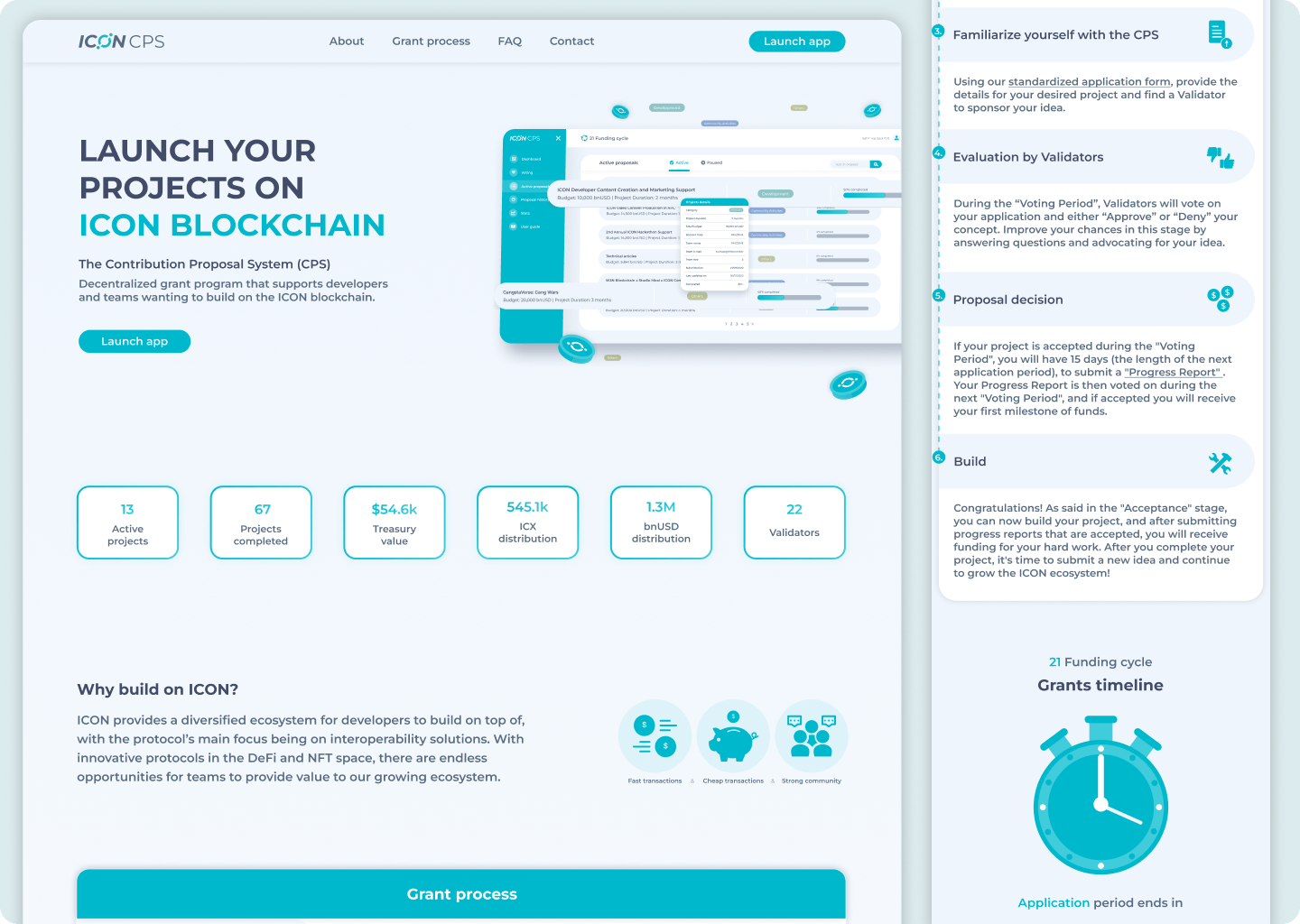
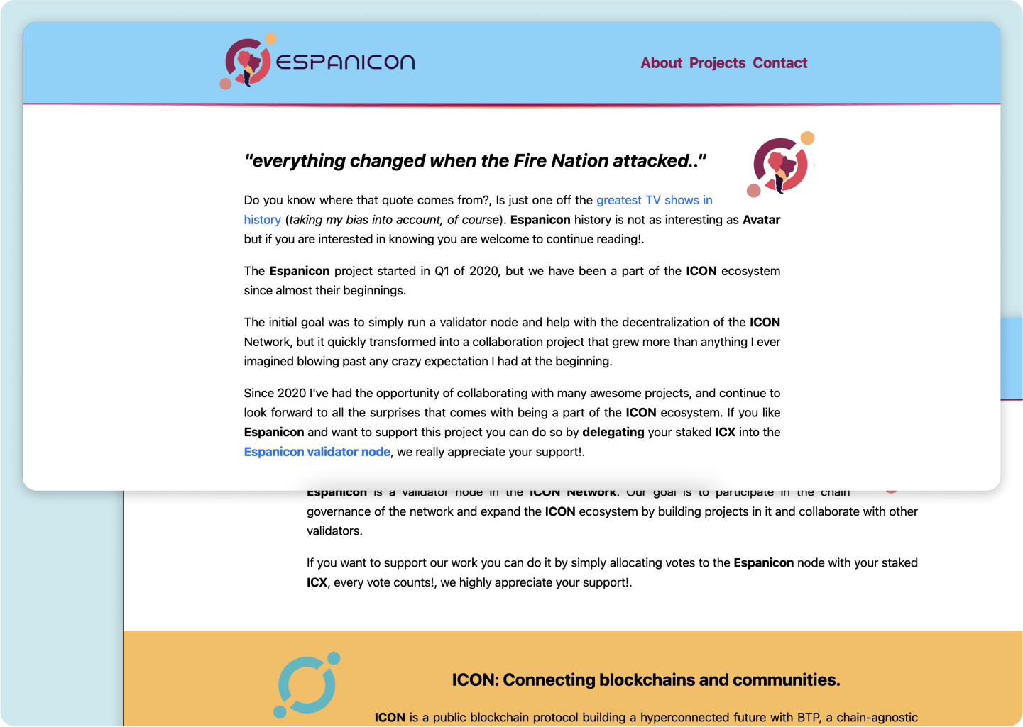
About ICON CPS project
I believe the ICON blockchain has enormous potential, and I enjoy creating new designs for it. I devised my own solution to improve the ICON CPS website. I used the same colors as on Node Butler because ICON has its own color that represents them, but I love their current purple color on the current website and think there's room to experiment with the color palette to make it more unique by adding purple or any other color.
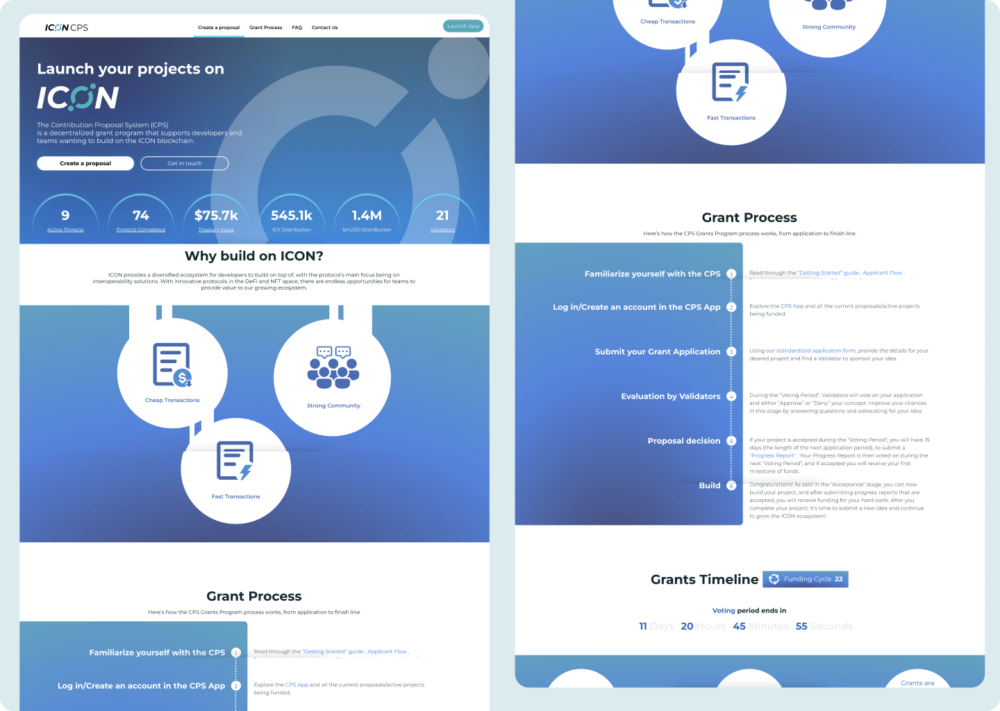
Here's ICON CPS current website UI:
Here's ICON CPS current website UI:
Protokol7 landing page
Protokol7 is a blockchain company that designs, builds and deploy Web3 based DeFi products.
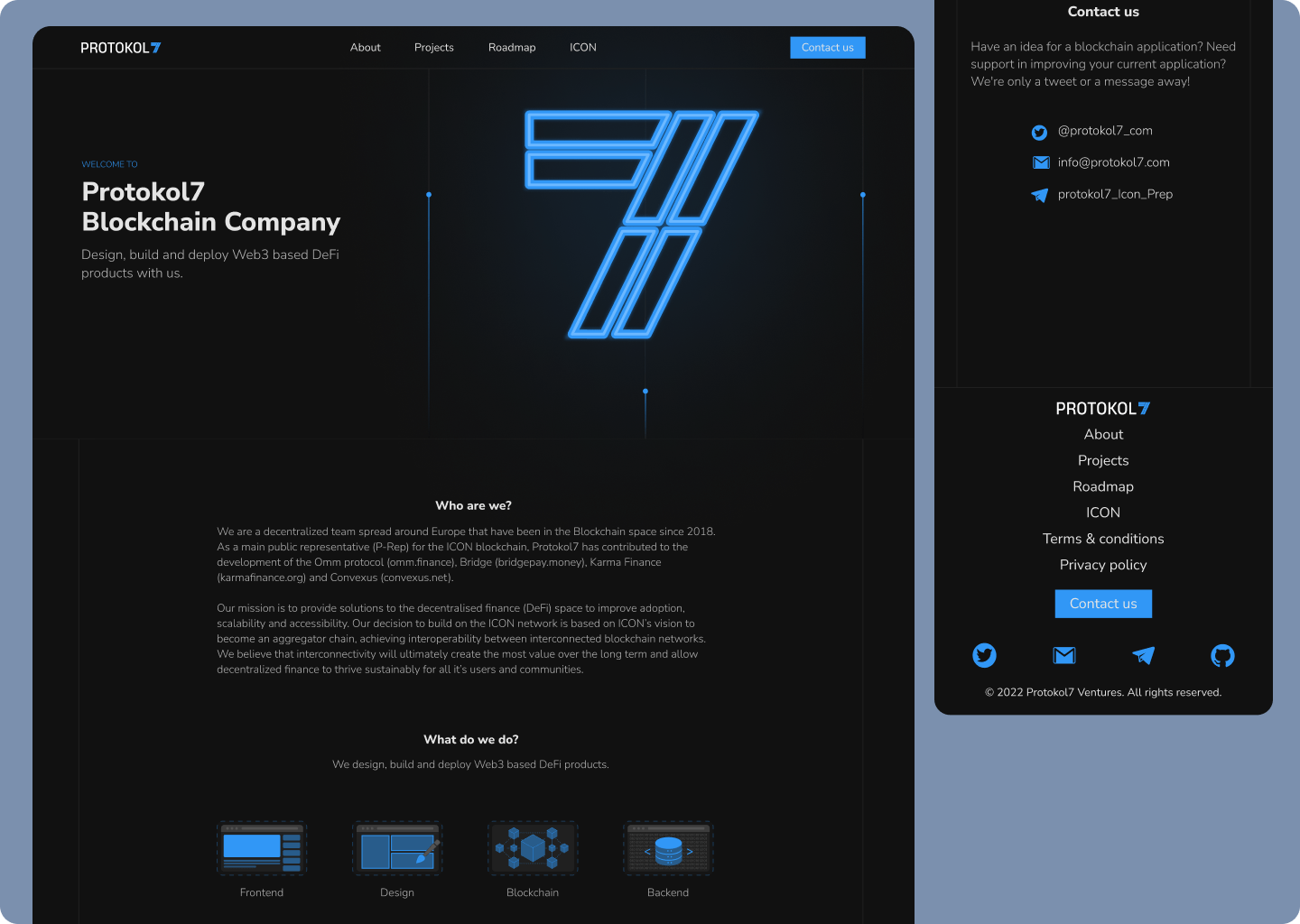
About Protokol7 project
Protokol7 had faith in me from the start. Their beginning coincided with mine. My first project was to design their website. I designed their entire brand from the ground up. The website evolved alongside the branding.
The UI's goals included a dark theme with blue and green colors. We started with green but eventually decided on blue because blue is known to represent "trust", "intelligence", "stability"...
Because they are a blockchain company, the logo is made up of blocks that come together to form the number 7. Last website design has lines all over it that connect everything together, like blockchain and the Protokol7 team.
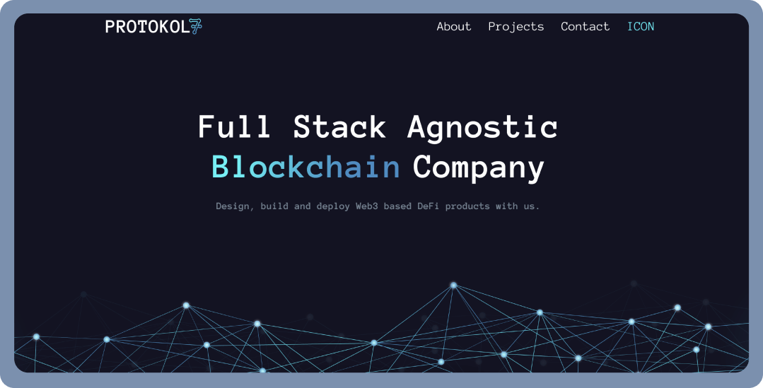
Here's an example of my first design for the Protokol7 website. Everything is much more rounded and simple. My emphasis for this font was very computer themed, and I used two colors for a gradient. Gradients were becoming popular for blockchain and cryptocurrency user interfaces at the time.
The UI's goals included a dark theme with blue and green colors. We started with green but eventually decided on blue because blue is known to represent "trust", "intelligence", "stability"...
Because they are a blockchain company, the logo is made up of blocks that come together to form the number 7. Last website design has lines all over it that connect everything together, like blockchain and the Protokol7 team.
Here's an example of my first design for the Protokol7 website. Everything is much more rounded and simple. My emphasis for this font was very computer themed, and I used two colors for a gradient. Gradients were becoming popular for blockchain and cryptocurrency user interfaces at the time.
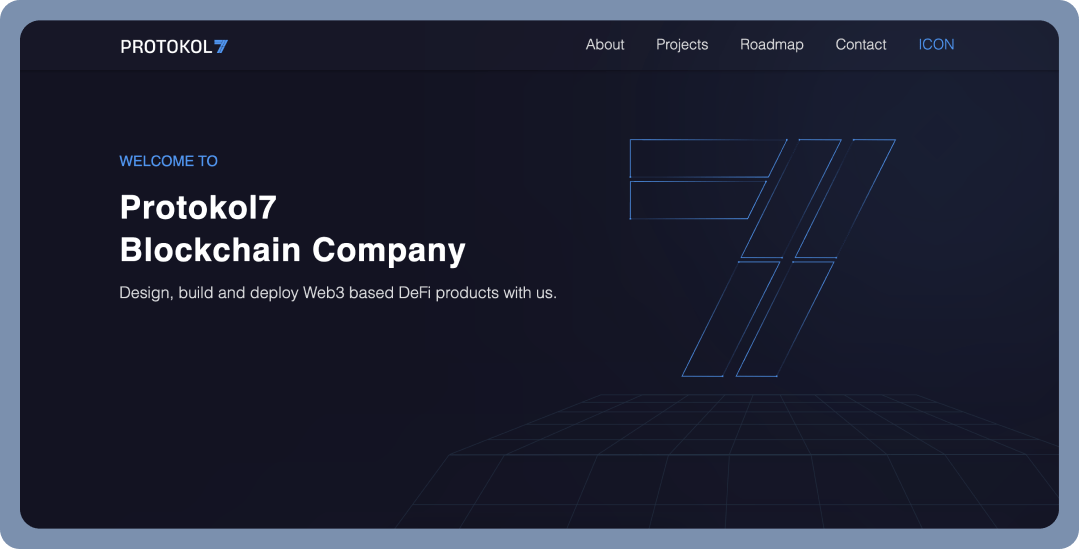
Here is an image of my second design for the Protokol7 website. As you can see, we went from a gradient to a single color. The font is unique, more serious, and professional. I concentrated on number 7 because it has significance for the team and provides an excellent opportunity to use it as a representation for blockchain.
I'm grateful that Protokol7 put their trust in me because working with them taught me and helped me grow as a designer. They provided excellent feedback, and it was a pleasure to collaborate with them.
Their project is an excellent example of my growth. As a designer, I learned from my mistakes and focused on improving my work each time to become better and better. And I'm still working on it, learning new things and coming up with new ideas.
Their project is an excellent example of my growth. As a designer, I learned from my mistakes and focused on improving my work each time to become better and better. And I'm still working on it, learning new things and coming up with new ideas.
Beehoney web store
Web store for honey products, from raw honey to honey spreads and other.
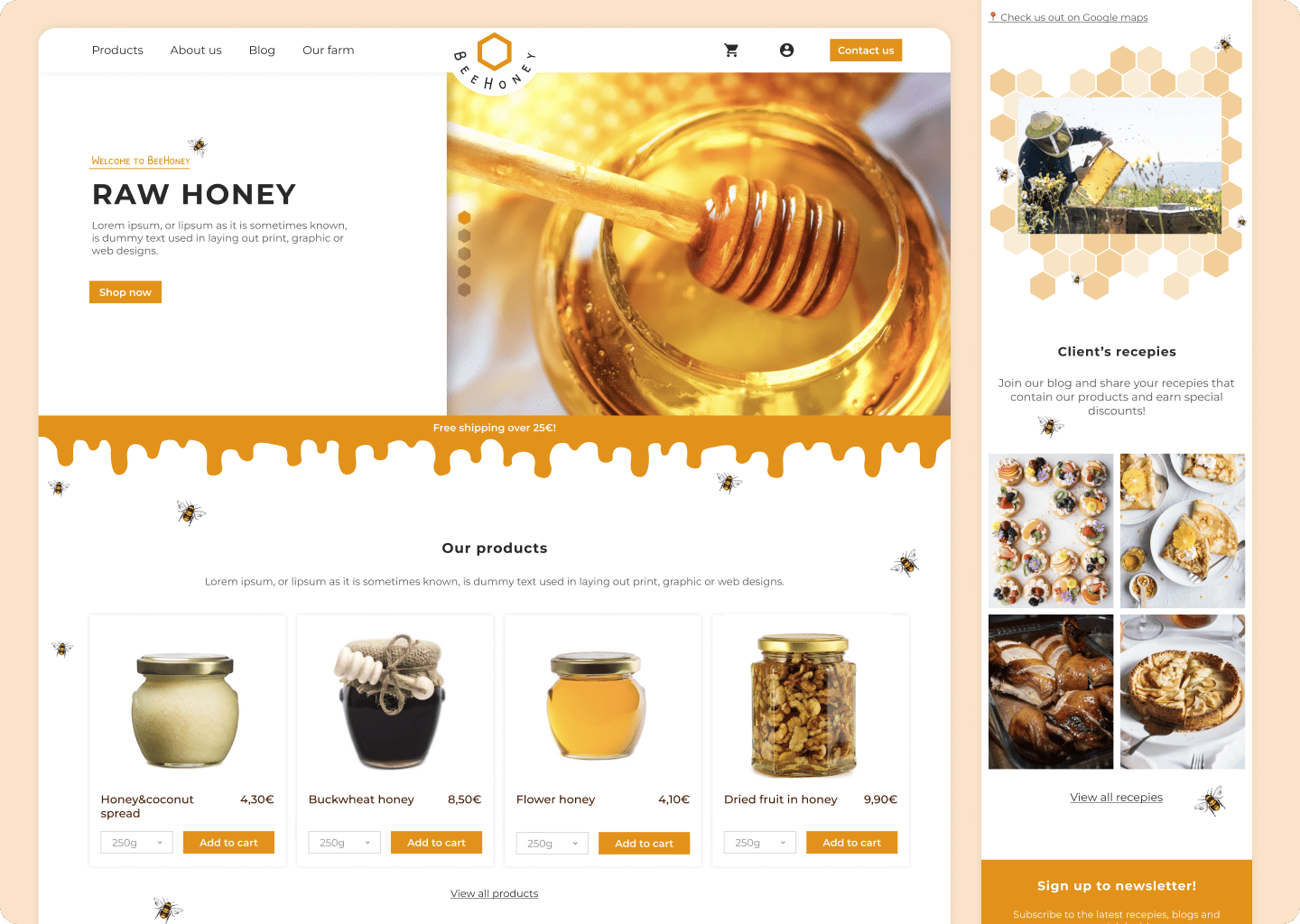
About Beehoney project
It is a made up project, made for learning purposes. I wanted to make a beautiful UI for honey web store. Recently I was looking to purchase honey from my country and noticed that nobody played around with honey comb shapes, or honey dripping to make their UI and honey branding more unique and interesting. So I made my own honey web store design.
When the user is shopping for honey, I want them to have honey cravings and the best user experience possible so that they will buy these honey products. I also added a section with delicious recipes in case they are undecided about purchasing. It is also an excellent way to engage clients, keep them loyal to your brand, and reward them with special offers.
When the user is shopping for honey, I want them to have honey cravings and the best user experience possible so that they will buy these honey products. I also added a section with delicious recipes in case they are undecided about purchasing. It is also an excellent way to engage clients, keep them loyal to your brand, and reward them with special offers.
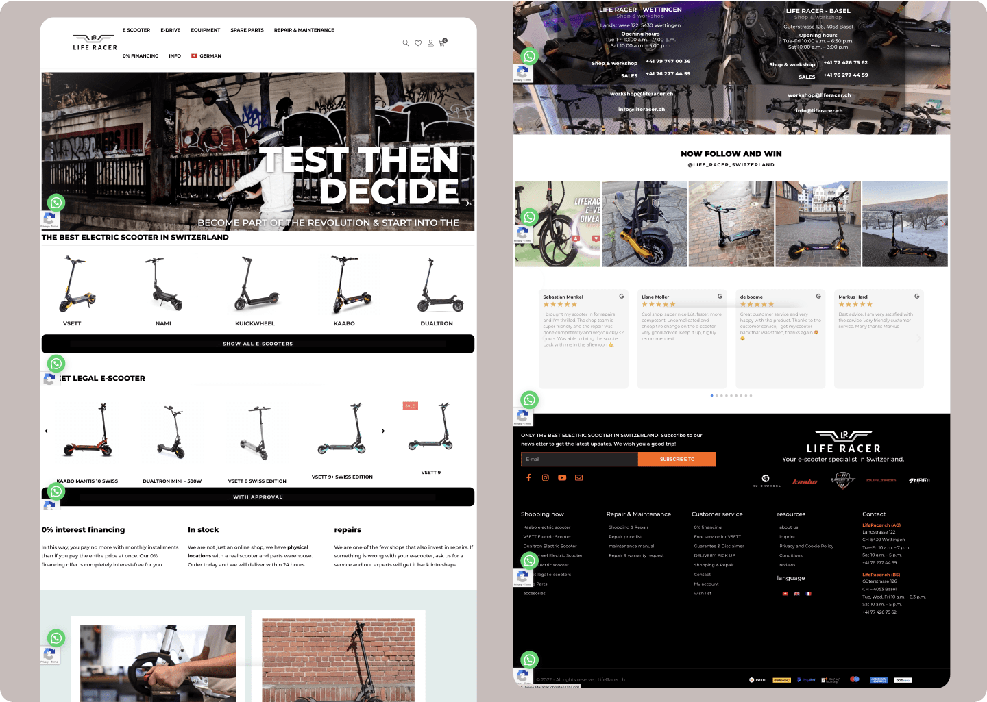
Liferacer web store
Web store in Switzerland that sells e-scooters of all kinds, and all other equipment.
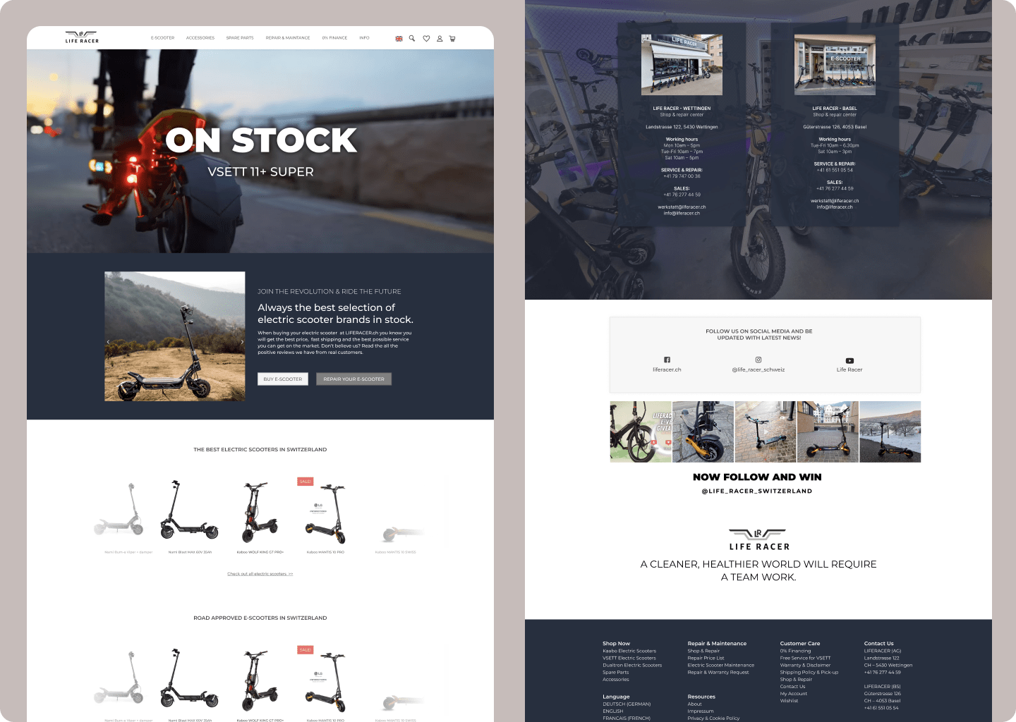
About Liferacer project
Liferacer is a Swiss company that sells e-scooters. They needed to "clean up" their website a little. They already liked the look of their website; they just wanted it to be a little more organized.
Here's how their website looked like:
Here's how their website looked like: